
UX Style Guide for TrekkSoft
How I created an English UX style guide for TrekkSoft, and how it will help the translation of the software into other languages.
OVERVIEW
Challenge
Inconsistent tone of voice across TrekkSoft’s platform. This also made it difficult to translate the software into other languages.
Solution
Create guidelines to ensure consistency of brand and tone of voice across the web and mobile apps.
How I helped
Developed a UX writing guidelines for product, development and account managers to refer to when writing about the product. Guidelines included guides for translators as well.
Collaborated with product managers to create a glossary for the team and our customers.
THE PROJECT
TrekkSoft is a booking system used by tour and activity operators around the world. Just like how you can book a hotel room from a hotel’s official website, they the same tools to tour companies, transfer companies, rental companies and activity providers as well.
TrekkSoft offers an extensive booking and management tool that can be used on desktop and a mobile app as well. The software has been translated into German, Italian and Spanish to meet the needs of a European customer base.
CHALLENGES
The software has developed extensively since it was first developed back in 2010. However, not much attention paid to the copy in the software. Typical errors such as mismatched titles and headers, convoluted tool tips and poorly structured sentences were found throughout the system.
There was also an acute disconnect in the tone of voice between sales and marketing materials, and product and customer success materials. While the website and blog were written in a crisp and helpful manner, the software itself was filled with technical jargon, outdated terminology and riddles.
The software was also poorly translated to three other languages because the original version wasn’t well written and there were no translation guides to assist the translators.
THE PROCESS
USER RESEARCH
Basic research was frequently carried out in the office. New employees had to learn about the system and their feedback was collected as well.
To get a better understanding of how tour and activity operators used the software, I regularly reviewed and compiled customer feedback from NPS surveys. Based on our Zendesk and Intercom data, I could also draw on common search terms and frequently asked questions to find out how our users wrote and talked about TrekkSoft. I used these insights to inform the writing guide as well.
During the writing process, I also passed on snippets of text to friends outside of the SaaS world (where most of our user base comes from) to check if they understood what each term, definition or guideline meant.
PRODUCT RESEARCH
I collaborated closely with product managers to gain a deeper understanding of certain terms and functionalities in the system. This gave me the freedom to create entirely new names and definitions for features that better reflected the functionality of the feature while maintaining TrekkSoft’s tone of voice.
We also held a workshop with our customer success team who regularly educated users about the system. From this exercise, we were able to identify confusing terminology and brainstorm better alternatives.
INDUSTRY RESEARCH
To ensure that we continued writing and designing for tour and activity operators, I perused popular sites like TripAdvisor and looked at what competitor systems were designing. News sites the Skift and Phocuswire were also helpful sources for crafting a more “business” tone of voice in the product.
I also referred to companies with great and consistent branding and tone of voice. I read through Slack’s technical documentation, dug up MailChimp’s style guides and read about UX writing from Intercom.
From this research, I was able to create a list of all the information I needed to include to ensure that anyone who picked up the task of UX writing would be able to continue developing TrekkSoft’s brand across all features and platforms.
THE FINAL PRODUCT
Together with my product manager, we were able to create a style guide and a glossary.
UX WRITING style Guide
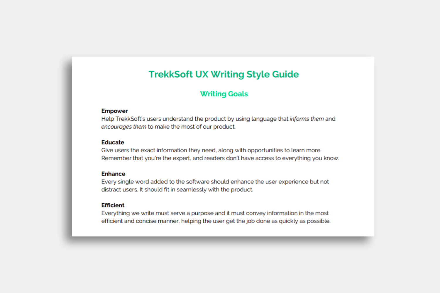
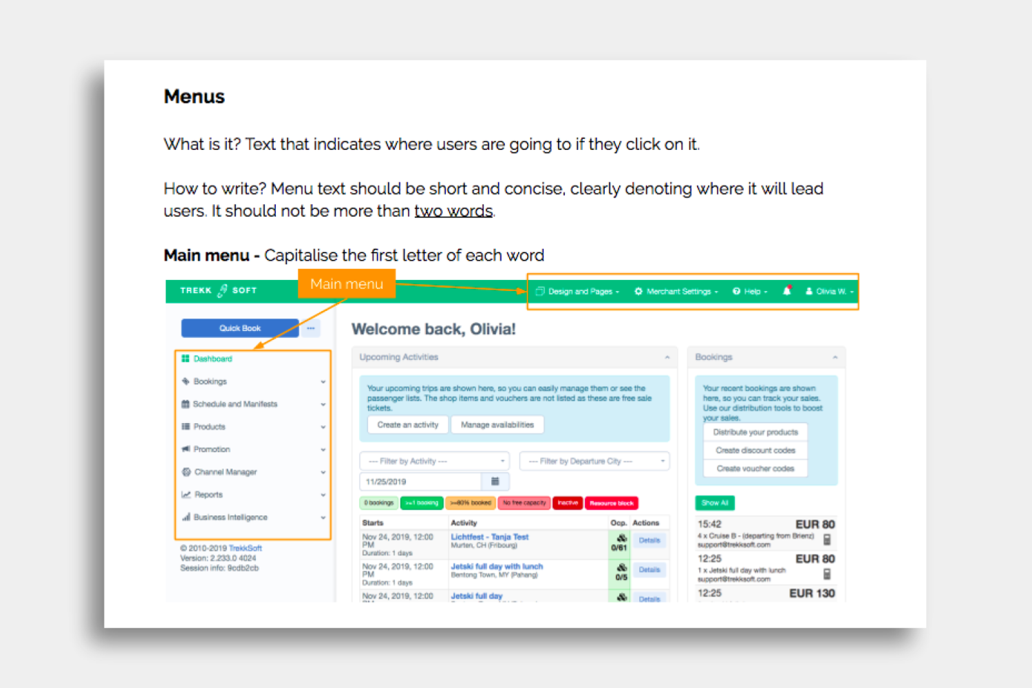
The style guide contained:
Writing goals - Outline what we want to achieve with UX writing.
Tone and voice - Explain and clarify TrekkSoft’s brand and tone of voice.
Writing principles and guidelines - Provide tips to review and edit copy to make any piece of writing stand out.
Rules to follow - Define basic rules to follow for instance using British English and the European format for dates and times.
Translation guidelines - Guidelines for our translators to follow. (I will continue developing this section as we get more feedback from them.)
Web Elements - Clarify what’s a menu, dropdown menu, header, sub-header and so on, and provide writing guidelines for each element.
TREKKSOFT GLOSSARY
The glossary contained definitions for almost 150 terms, titles and feature names. This document is currently being translated into other languages to aid our translators as well. You can find the English version here.
Featured image by Brands People on Unsplash

Booking flow for tour and activity websites
How I created UX copy for TrekkSoft’s booking and checkout flows.
OVERVIEW
How I helped
Collaborated with product managers and UX designer to create succinct copy throughout the booking and checkout flow.
Developed new copy for the booking widget.
Challenge
Guide users through TrekkSoft’s Booking Widget 3.0
Solution
Create simple and easy-to-understand copy.
THE PROJECT
TrekkSoft is a booking system used by tour and activity operators around the world. Just like how you can book a hotel room from a hotel’s official website, we offer the same tools to tour companies, transfer companies, rental companies and activity providers as well.
We wanted to update our booking widget so that experience providers using TrekkSoft on their websites could provide a seamless booking and payment flow, increasing their direct website bookings in the long-run.
We specifically wanted to improve the way we upsold travellers with add-ons and extras, and the way we asked end-customers for their information to complete a booking.
CHALLENGES
The project was challenging as the same booking widget would be used by tour operators, rental companies and activity providers - each company providing very different services to travellers. The booking flow needed to accommodate all the different ways different service providers would talk about their types of service.
Similarly, the booking widget is also embedded to different operator websites, each with its own unique brand, tone of voice and end-customer. Therefore, the widget needed to blend in seamlessly with all the different brands using TrekkSoft, offering a cohesive booking and checkout experience for every single company using TrekkSoft.
When booking a tour, operators often need to provide information about certain schedules, ticket types, additional options to enhance a tour and so on. All this content is then added to the booking and checkout flow. Therefore, when writing for the widget, every word had to fit in with the information tour operators would later add on to the booking flow.
TrekkSoft also offers the booking widget in German, Spanish and Italian which means that the copy I produced had to be easily translated into different languages and cultures.
THE PROCESS
USER RESEARCH
I reviewed user recordings of the booking flow with the Product Manager responsible for this project. Together, we found the bottlenecks in the booking and checkout flow, and brainstormed with the UX Designer to come up with a clearer user flow.
Once a prototype for the new widget was created, the product manager (PM) conducted multiple rounds of interviews with tour and activity providers who offered more insight into how their customers found the booking experience.
As I am also in regular contact with TrekkSoft’s users, I was able to combine my own understanding of our users with the user recordings and feedback from the PM’s interview to create simple guidelines for this project.
INDUSTRY RESEARCH
I also conducted my own research, looking at how competitor booking systems had designed their booking and checkout flows.
To understand how industry leaders designed their booking flows, I looked at other travel tech companies like TripAdvisor, Expedia, Booking.com, GetYourGuide, Kayak and so on. I also reviewed consumer sites like Amazon to find best practices for designing checkout flows.
In my research, I paid particular attention to the use of language, error messages and tooltips in these user flows.
THE WRITING PROCESS
To bring the copy from prototype to the final product, I followed three simple rules:
Trust contextual cues and remove unnecessary text.
Always find a simpler way to convey the message.
The copy should always reflect the tour and activities industry.
At every step of the user flow, I came up with alternative ways to convey a message and questioned if it was more concise than before. I also made sure to run the copy by native German, Spanish and Italian speakers to make sure that it would translate well.
THE FINAL PRODUCT
Below are some examples of the changes I made to improve the booking and checkout flows. The examples were taken from different websites to demonstrate the versatility of the booking widget.
BOOKING FLOW
In this step, users need to select the number of tickets they would like to book. I simplified the “Back” button in the top left, and updated the header so that it reflects the way tour and activity operators talk about their services.

Booking widget used by a surf school in England.
Here, users can select additional equipment or services to enhance their booking. I changed the way we referred to the number of people booked for a trip from “seats” to “guests” in the top bar. The header was also updated to give users a better idea of what they’re being offered here.

Booking widget used by an adventure company in Norway.
NOTIFICATIONS
The booking system allows customers to book tours that require manual confirmations from operators. We wanted to notify bookers that finishing the booking process meant that they allowed us to withhold a pre-authorised sum until the booking was confirmed.


Writing samples from 2019
A snapshot of some content I produced in 2019.
UX WRITING SAMPLES
Small changes, big results.


FEATURE DOCUMENTATION
I took part in a product sprint and together with product managers and developers, we created a Tip feature for users to take tips via our iOS app. I then created the support documentation for the feature release and executed the communication strategy for the feature release.

TREKKSOFT’S TRAVEL TRENDS REPORT 2019, EXCERPT ON BOOKING TRENDS
Raw data was gathered from our backend with the help of Product Managers. Then, I analysed the data and shared my findings in the report. To further explore booking trends, I also interviewed the founders of our distribution partners.


INFOGRAPHIC: FINDINGS FROM 2019 TRAVEL TRENDS SURVEY
I was tasked with creating visual material as a teaser to our travel trends report. In conjunction with World Tourism Day, I decided to put together an infographic sharing data about the people who make up the tourism industry.

Click to enlarge
EMAIL NEWSLETTER: MONTHLY CUSTOMER UPDATES (EXCERPT)
To increase customer engagement, I started to send out monthly round-ups to give them an overview of everything that’s happening at TrekkSoft (the company and the product).

Click to enlarge